Digital Graphics
This page is a showcase for the digital graphics projects I've worked on for school and just for fun. Although I had some earlier experience with simple computer illustration software, Adobe Photoshop is much more advanced. I took Digital graphics classes for three years and have discovered the many amazing things that Photoshop allows me to create. I have designed my father's business cards as well as my own, and have designed cards and logos. This page shows my growth, from my first year to present day. If you have any interests in a project you would like for me to do, or would like for me to design cards for events of business, email me at [email protected].
Semester 1
Most of semester 1 consisted of designing posters and editing photos as well as adding our own touch to it.
|
|
|
|
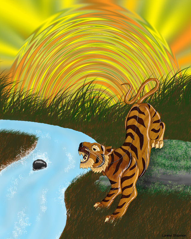
The image of the tiger was the final for semester 1. I had to put the tiger together like a puzzle (a very complicated puzzle with mis-matching pieces) and then design the background.
|
|
Semester 2
Semester 2 was more interesting as the assignments became a little more diverse and unique (I've always had a problem with doing assignments the same as the entire class). Apparently semester 2 digital graphics is difficult to make it to.
|
|
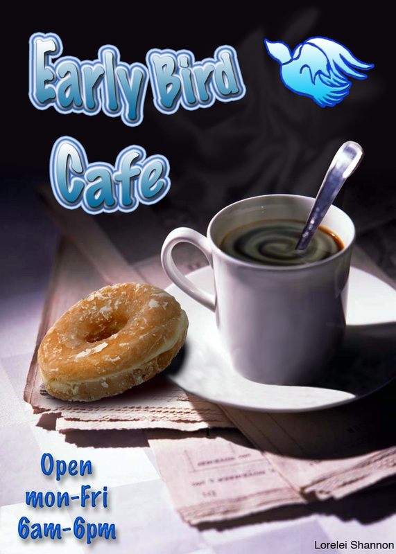
Both of these were poster designs. The image to the left had to be edited before the poster could be designed. I was required to erase a lemon peel, move the spoon into the cup, erase the reflection of the peel and the spoon from the plate and cup, and restore the newspaper. I then added the donut, the cream in the coffee, the steam, and the text.
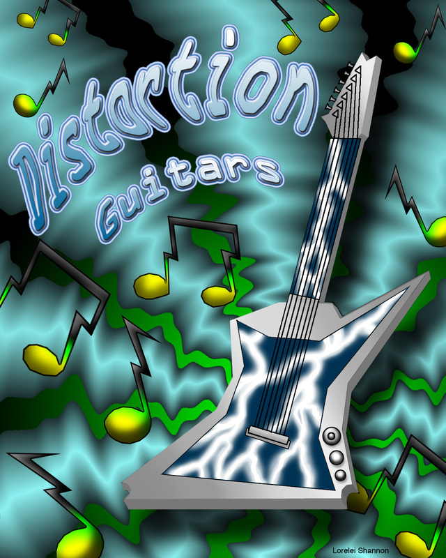
The guitar poster was completely original with no photos used.
The guitar poster was completely original with no photos used.
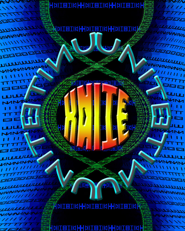
The point of this poster was to create a design using one word multiple times. The word is unite. This one took a lot of time and I learned the hard way that it is not wise to make a computer "think" too much. I crashed Photoshop and lost an hours worth of work.
|
|
|
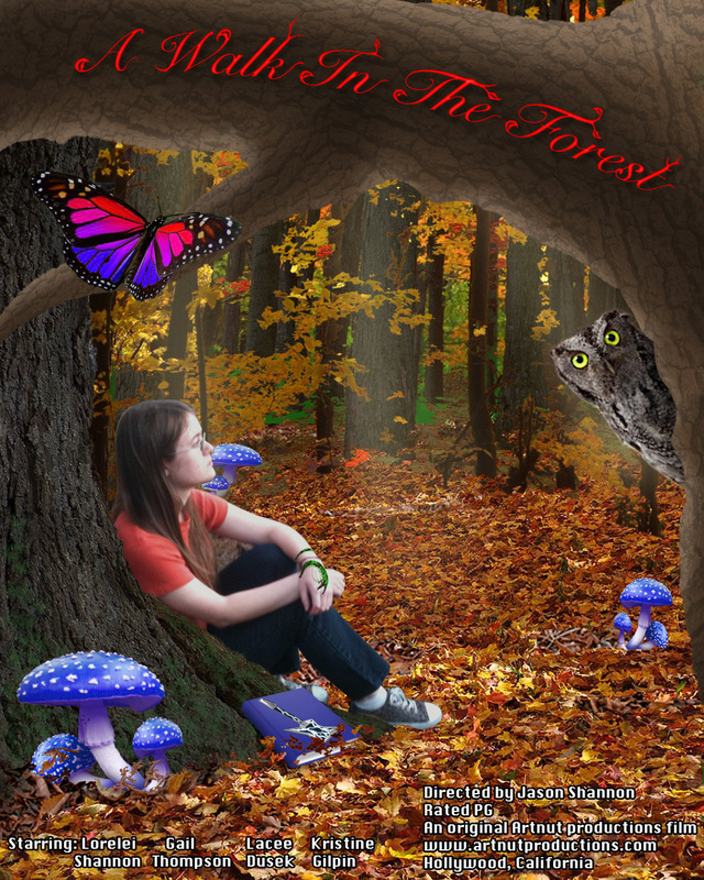
The image to the left was a movie poster that required me to be in it. The video to the right was the final project which was a cartoon animation. The characters are from my comic strip. The video was 70 individual frames and took me two weeks to complete.
Animation
When Graphic artists get bored...
These are some of the images I did for an online website that had contests that include graphic design and other things. You can visit this website at www.worth1000.com.
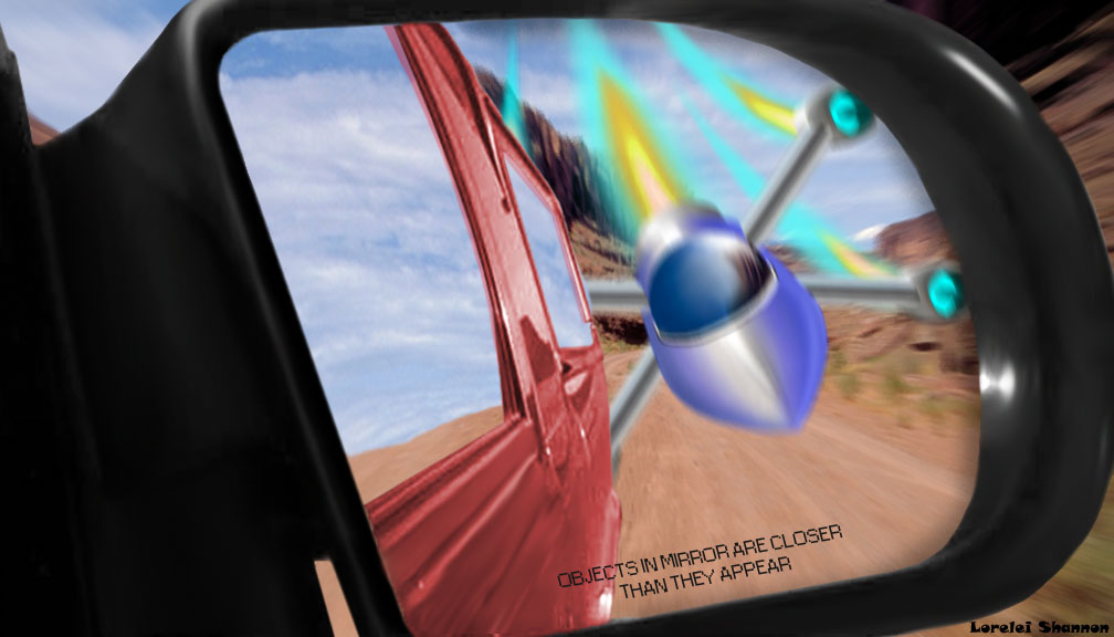
Incoming!
This picture wasn't for any contest, but I decided to play with the phrase on every car mirror; "Objects in mirror are closer that thet appear". Just to make it clear, the person looking in the mirror sees some sort of spaceship coming at them from behind.
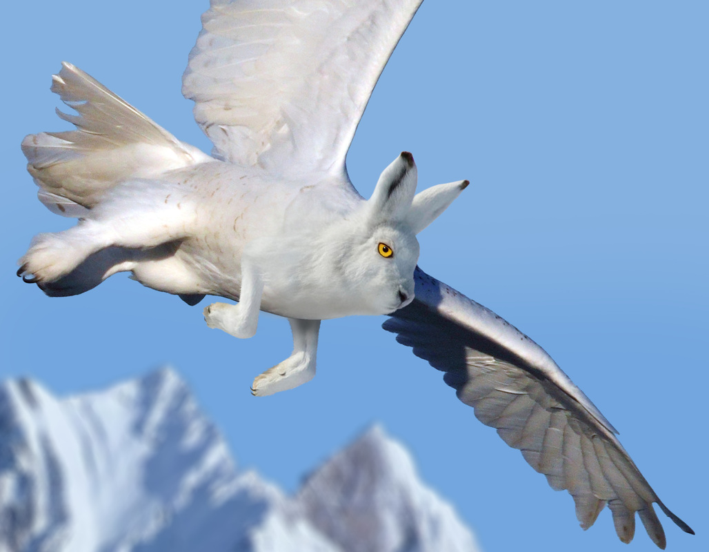
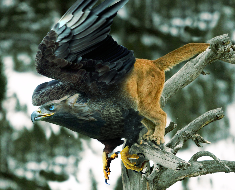
Predator prey
The theme of this contest was to make an animal that is a cross between a predator and its prey. I did a snowy owl and a snowshoe hare.
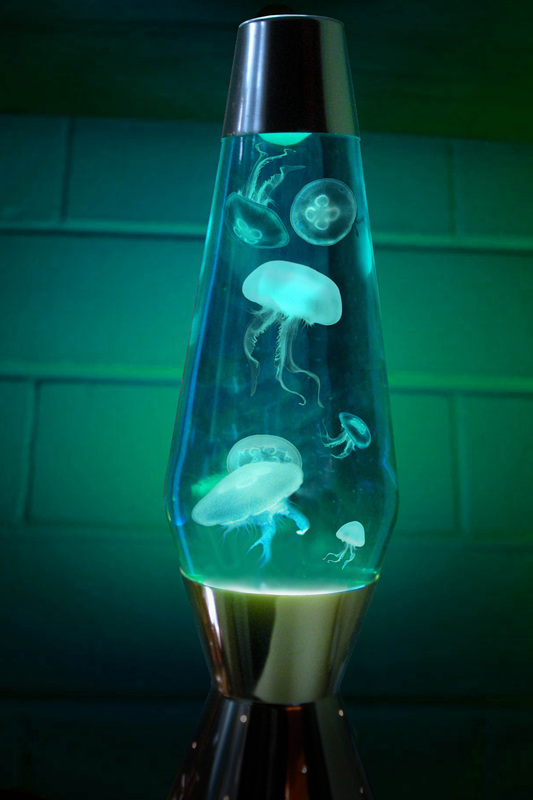
Jelly lampThe rules of this contest was to replace an everyday object with something from the ocean. This won first place in this contest.
|
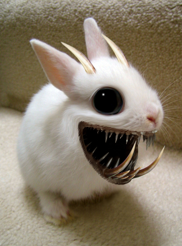
Deadly cuteThe rules of this contest was to make a cute animal with a deadly side to it. My entry, "The Fuzz" won first place in this contest.
|
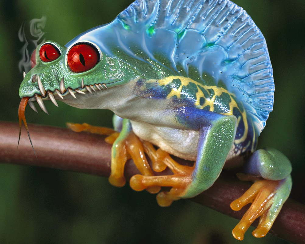
Chop a frog...
The rules of this contest was to basically take a frog and do anything you want with it. My entry, "Portuguese Frog-of-war" won fourth place in this contest.
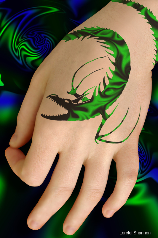
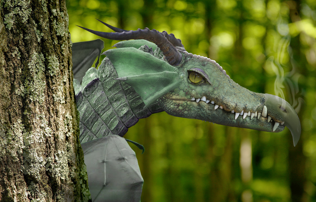
Dragon
The rules for this contest was to create a dragon. I made this dragon out of six different animals.
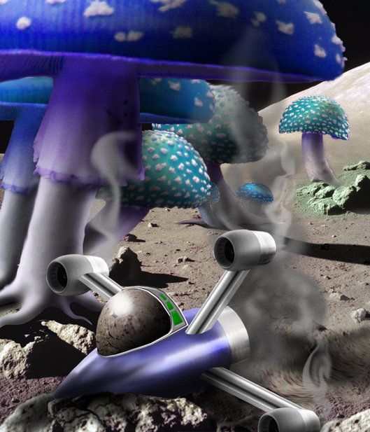
Rhyme time
The rules of this contest was to make an image wih a rhyming theme.
My entry was "Marooned on the Moon of the Shrooms of Gloom and Doom".
The spaceship was made out of random objects. This entry won third place in this contest.
My entry was "Marooned on the Moon of the Shrooms of Gloom and Doom".
The spaceship was made out of random objects. This entry won third place in this contest.
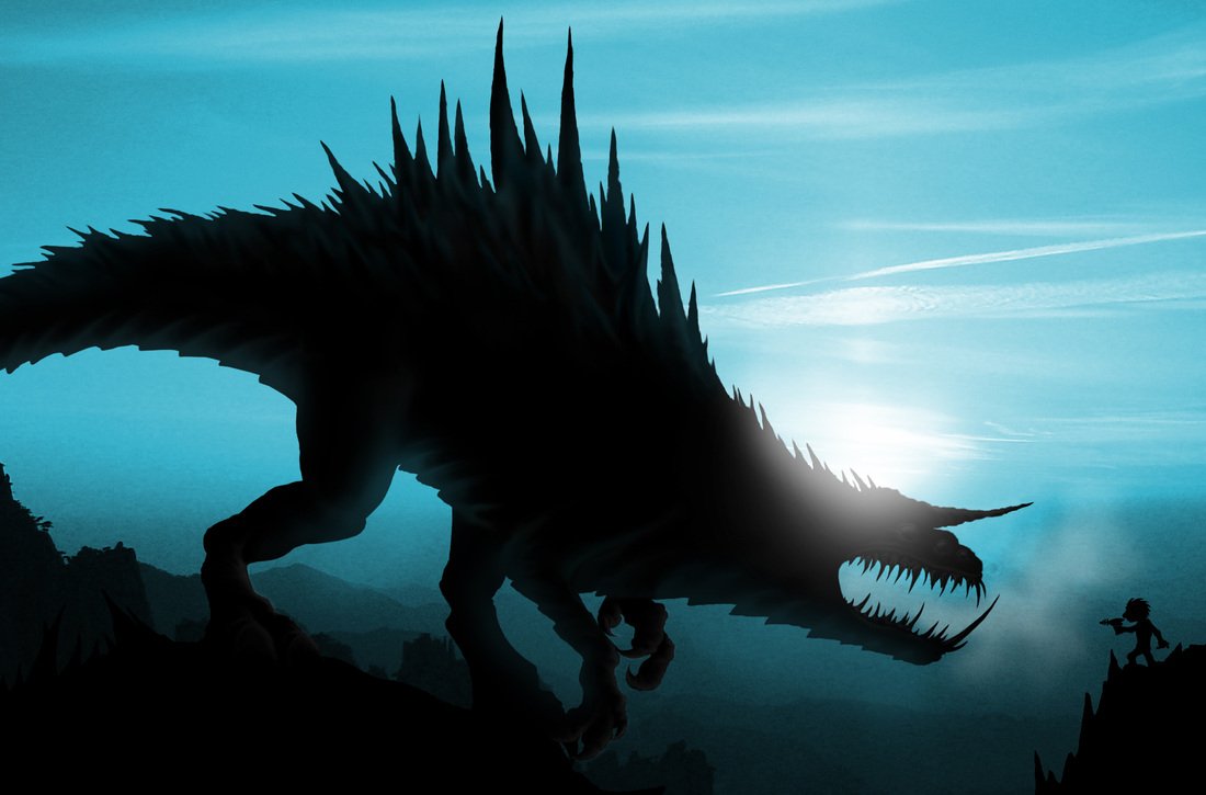
silhouettes
The rules of this contest was to create a silhouette that lookes realistic, but it can create an impossible or amazing picture. The background was the only picture used from the internet. However, I did edit the background picture to get it to have the apperance of an ice planet. The monster and the little spaceman are both original ideas. This got 9th out of 40 entries.
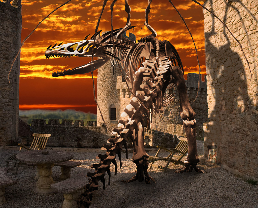
Castle Guardian
The contest rules was to take a provided photo and do whatever you want with it. It took me hours to remove the dinosaur from the original photo, plus my computer was having a seizure. After modifying the skeleton, I then edited the background (sky, colors, shadows). This entry won first place.
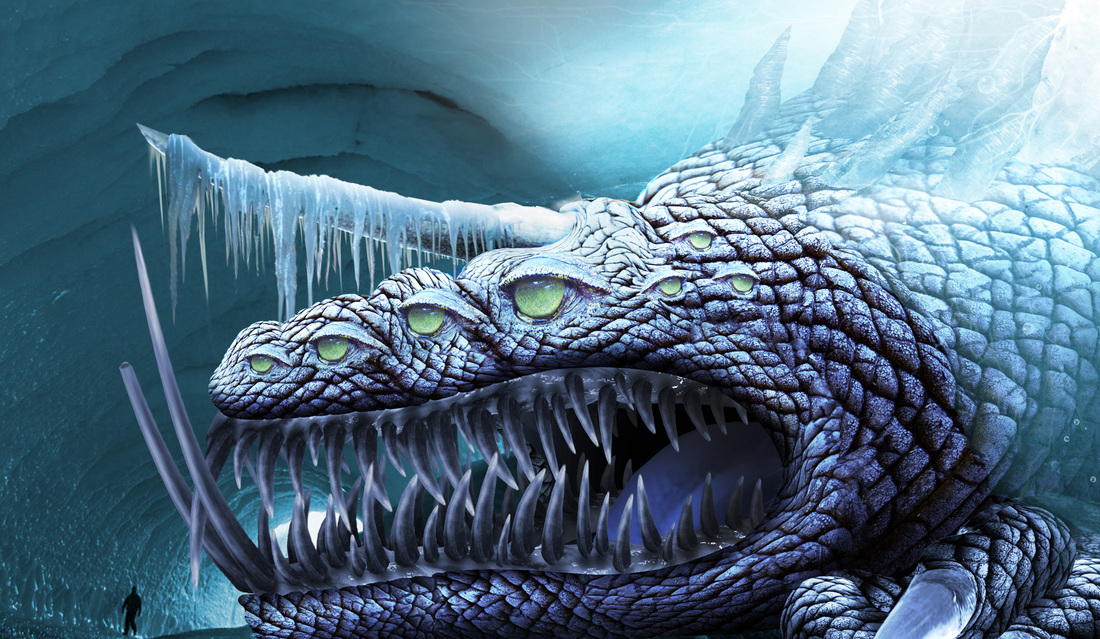
In Ice
The objective of this contest was to make something frozen in ice, and it had to look impossible. The creature was hard to make because I was using the skin texture of an elephant and warping it several times. Making it look frozen was difficult because this was my first attempt at ice.
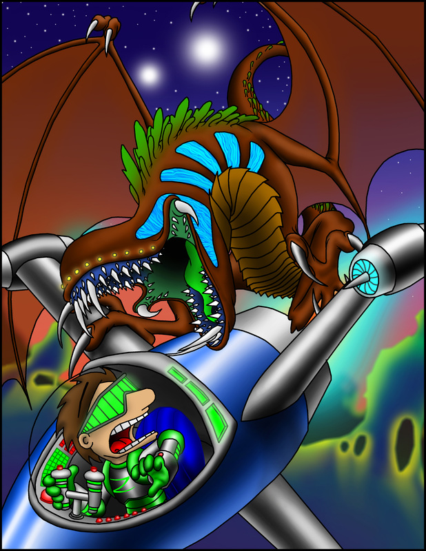
Aerial Attack
This was for an illustration contest that included photoshop illustration. The theme was winged fantasy and it could be in any style. This won 14th place out of 31 entries.
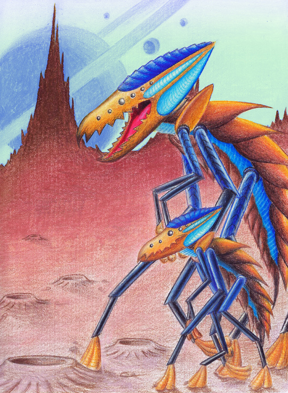
Niborgs
This was an illustration contest where you designed a unique or "new" creature. This got 2nd place out of 7 entries and was illustrated with colored pencil and edited in Photoshop.
Behind You...
The theme of this contest was to make an illustration depicting "creepy". This won third place out of 5 entries.
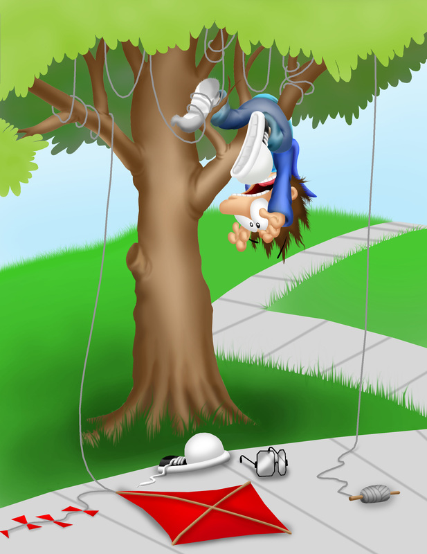
Kite flying mishap
The theme was to create a picture telling a story based on the aftermath of an event that occured. This was illustrated in Photoshop and won 2nd place out of 11 entries.
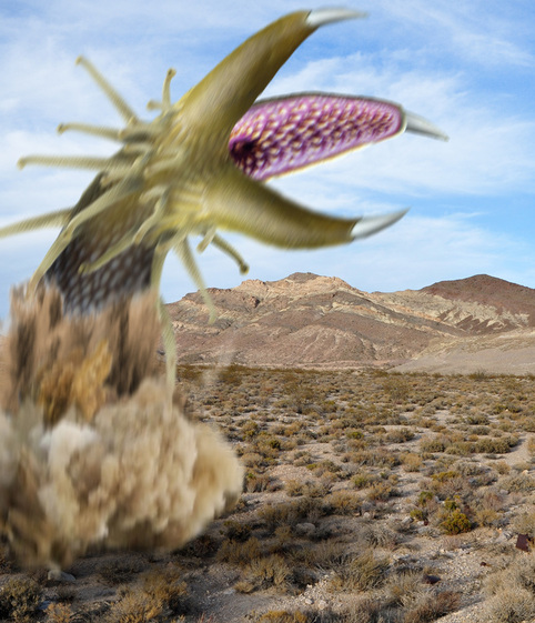
Mongolian Death worm
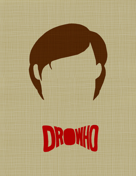
Doctor Who
The theme of this contest was to create a movie poster with a little as possible, but enough to make it obvious what the movie was. My entry won 12th out of 72 entries in an advanced contest.
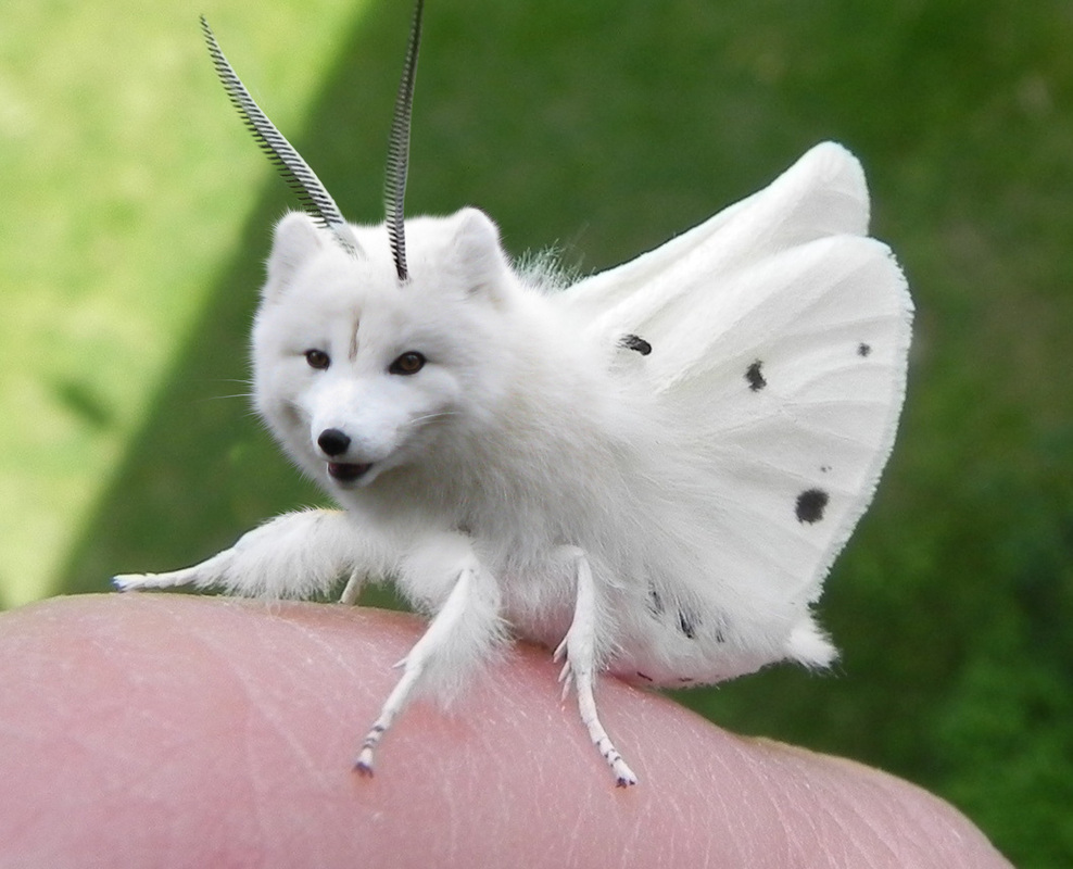
Fox moth
The contest theme was to combine an insect with a mammal. This won 5th out of 32 entries.
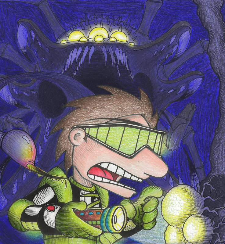
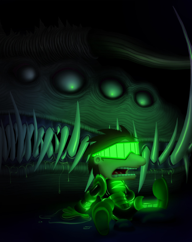
In the Dark
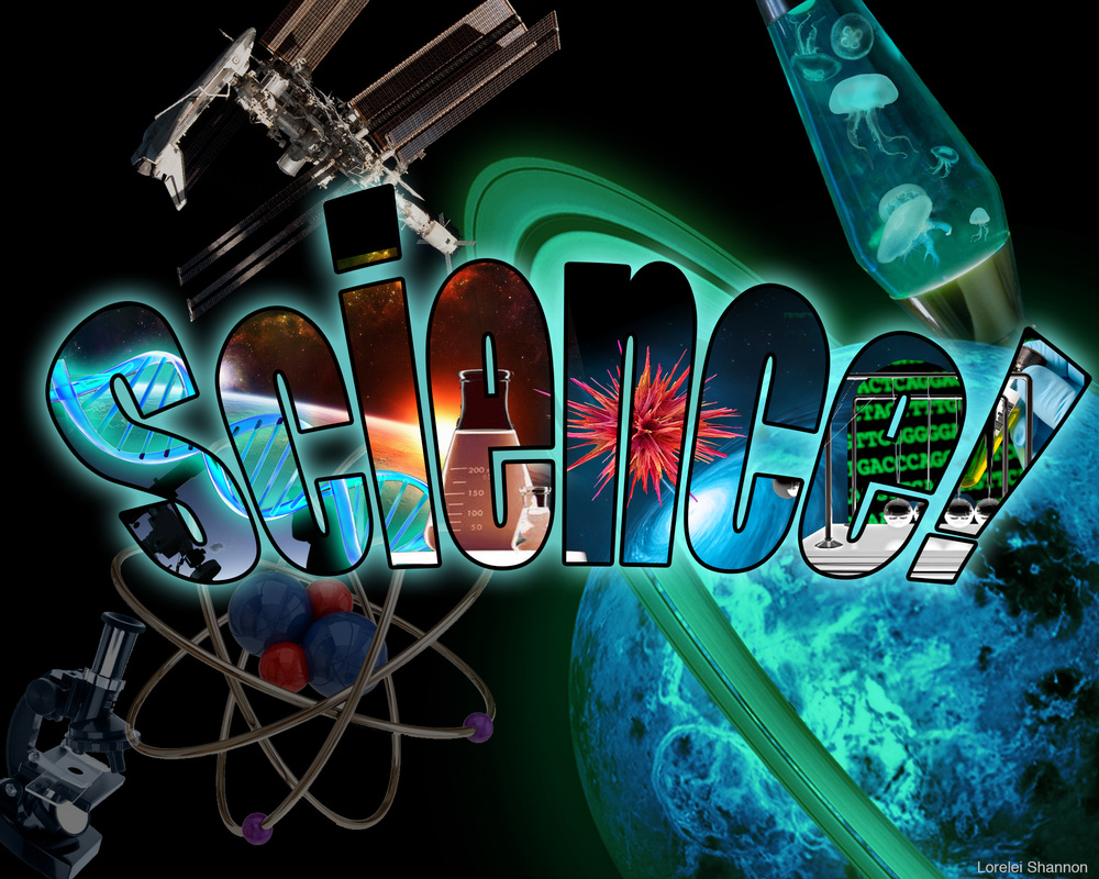
Science! Poster